Social Marketing · Student project
A story behind the poemỔ điện lên tiếng
Poster design and message testing for electrical safety
I developed the concept, key visual and copy for the warning posters in this student campaign. Our team tested two directions with 140 participants to choose the campaign’s approach.
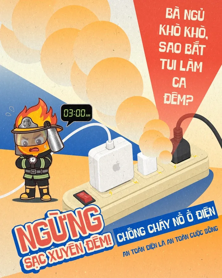
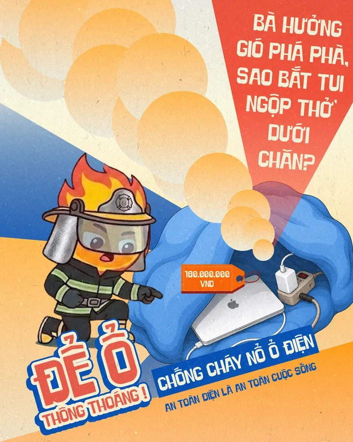
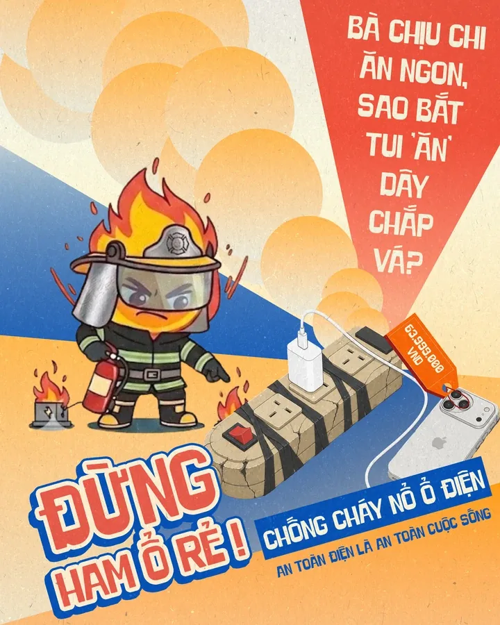
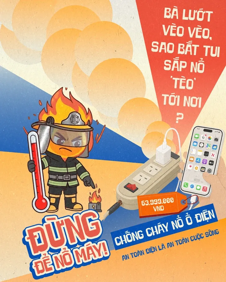
“Ổ điện lên tiếng” · Concept, key visual & copy: Lương Khởi An
Student audience and campaign objectives
Our five-person team planned a simulated campaign about electrical-use habits among students living away from home in Ho Chi Minh City. They knew fire safety mattered, but convenience and familiar routines could get in the way.
- MY ROLE
- Concept development · Key visual · Copywriting
- CONTEXT
- Social Marketing course · Simulated campaign · Team of five
We compared an advisory direction built around a simple routine with the warning direction I developed. In my posters, the power strip spoke about the risks.
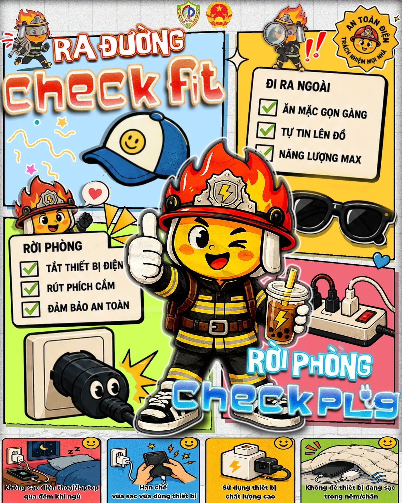
A/B testing of the two poster directions
I hate how you make me testwhether my words can move someone.
Our pretest randomly assigned 140 participants to two poster directions, with 70 in each group. After viewing the posters, they reported their behavioural intention and belief in the information.
participants70 people / group
A/B PRETEST| Measure | AAdvisory | BWarning |
|---|---|---|
| Intention to change behaviour | 5.55 | 6.27 |
| Belief in the information | 5.59 | 6.31 |
Source: team results, G01_Final, pages 32–33. Self-reported intention and belief after exposure.
The warning direction scored higher on both measures. Our team used that evidence to choose the direction I’d developed.
The scores describe these two poster executions and participants’ self-reported intention and belief. A follow-up after implementation would be needed to measure changes in everyday habits.
Concept and visual development for Ổ điện lên tiếng
I hate how you make me finda voice for what we overlook.
I gave the power strip a voice in everyday student language, combining familiar reminders with warning images. I developed this approach from the fire-safety examples our team had reviewed.
Personification of the power strip
The power strip speaks as the object affected by unsafe habits.
The use of everyday student language
“Bà / tui”, night shifts and daily routines.
Visual warnings about unsafe electrical habits
The posters pair a firefighter mascot with devices and images of potential loss.
This time, the power strip does the complaining.
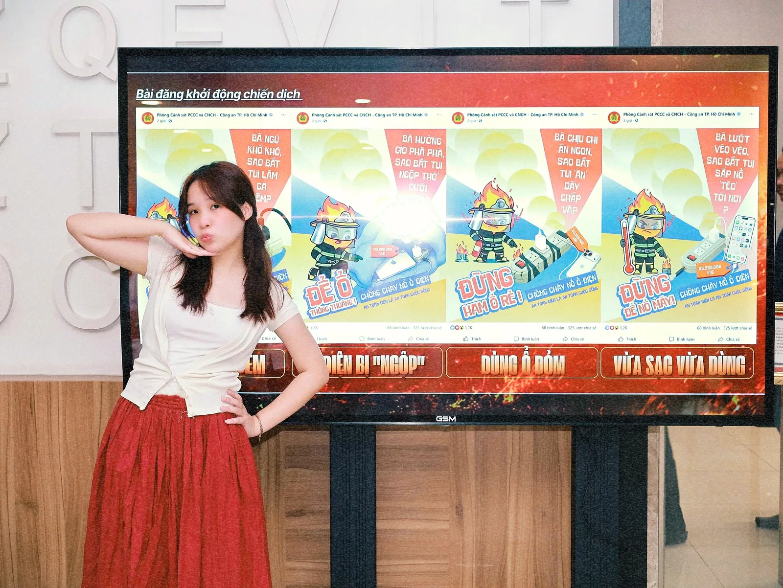
The power strip’s complaints turn familiar habits into a conversation: working night shifts, being smothered under a blanket or facing the consequences of careless choices. Each poster ends with a specific reminder.
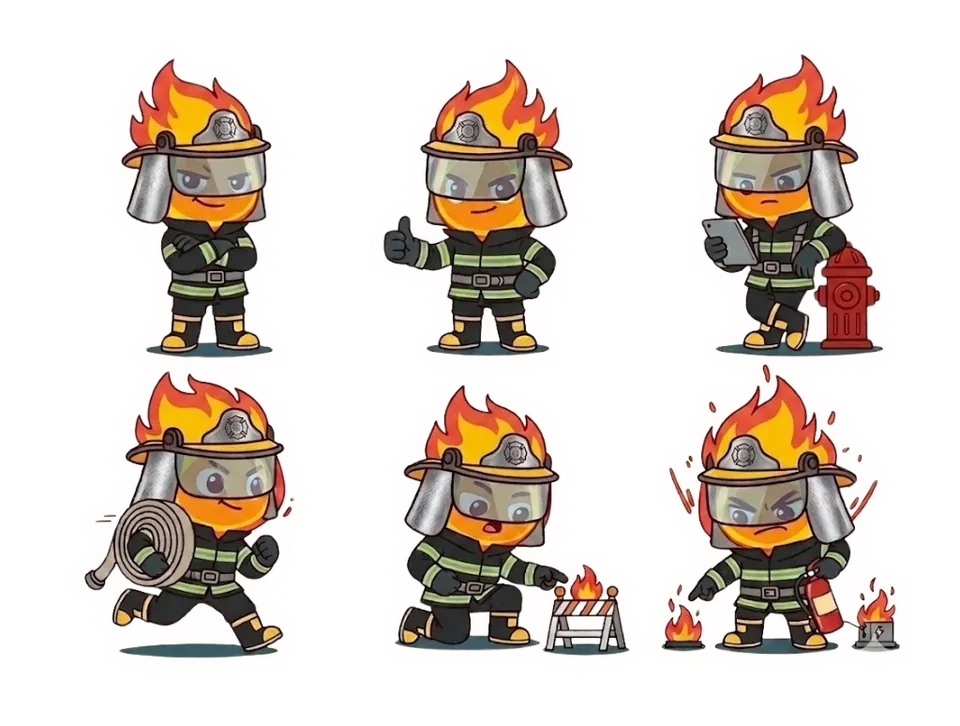
Visuals and copy for the four posters
I developed the key visual and copy into a coordinated set of four posters. The power strip’s voice, firefighter mascot and warm colours against blue made them recognisable as one campaign.
Display of the campaign posters at university
Our lecturer proposed displaying the work at university. The photos show the designs at the exhibition. In the recorded clip, the posters play on a screen beside the elevators.
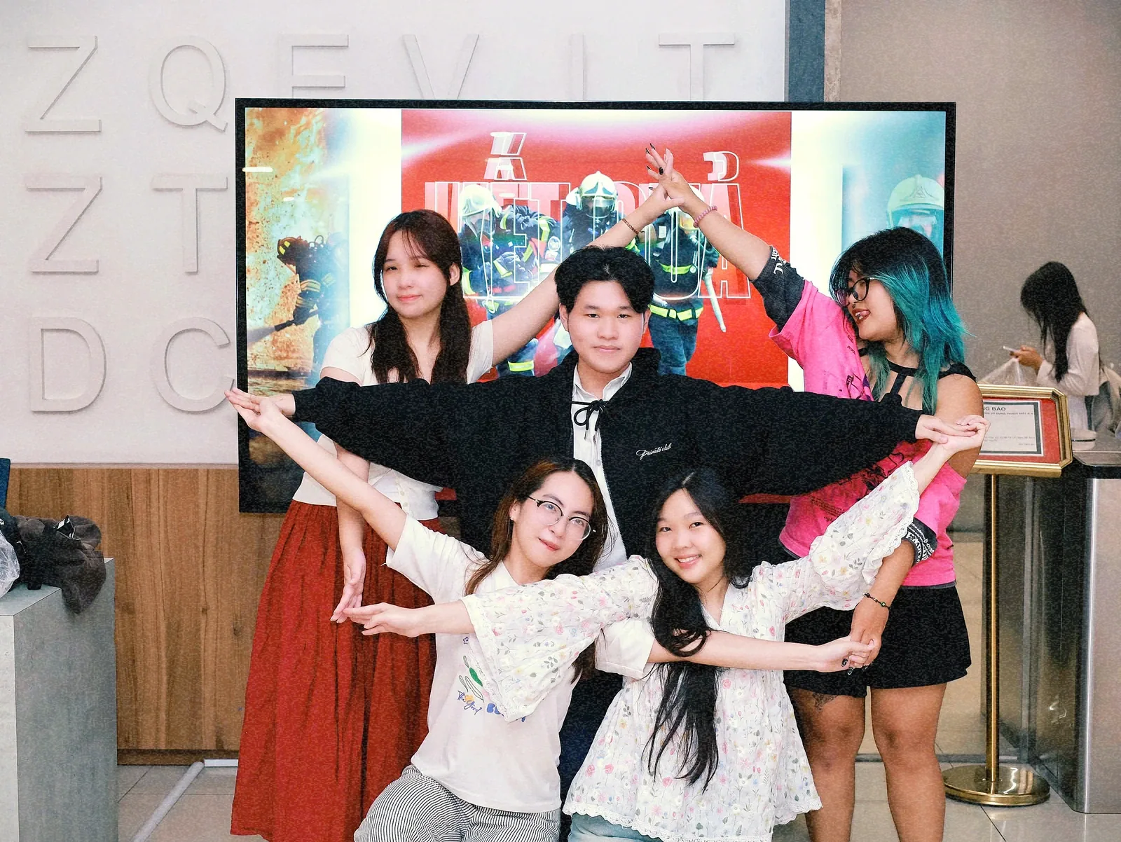
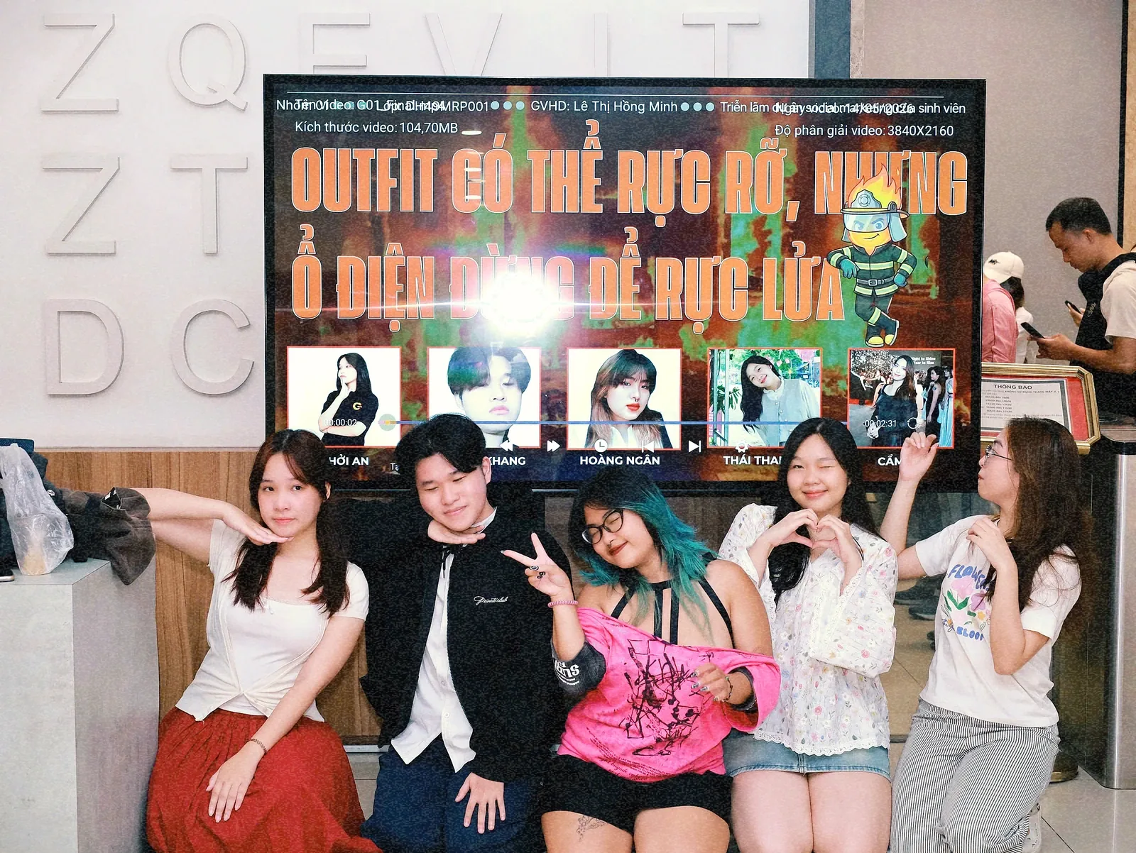
The team’s research and statistical analysis informed the choice of my warning direction. I learned to check audience responses before taking a creative approach further.
The letter goes on.
Back to the poem.